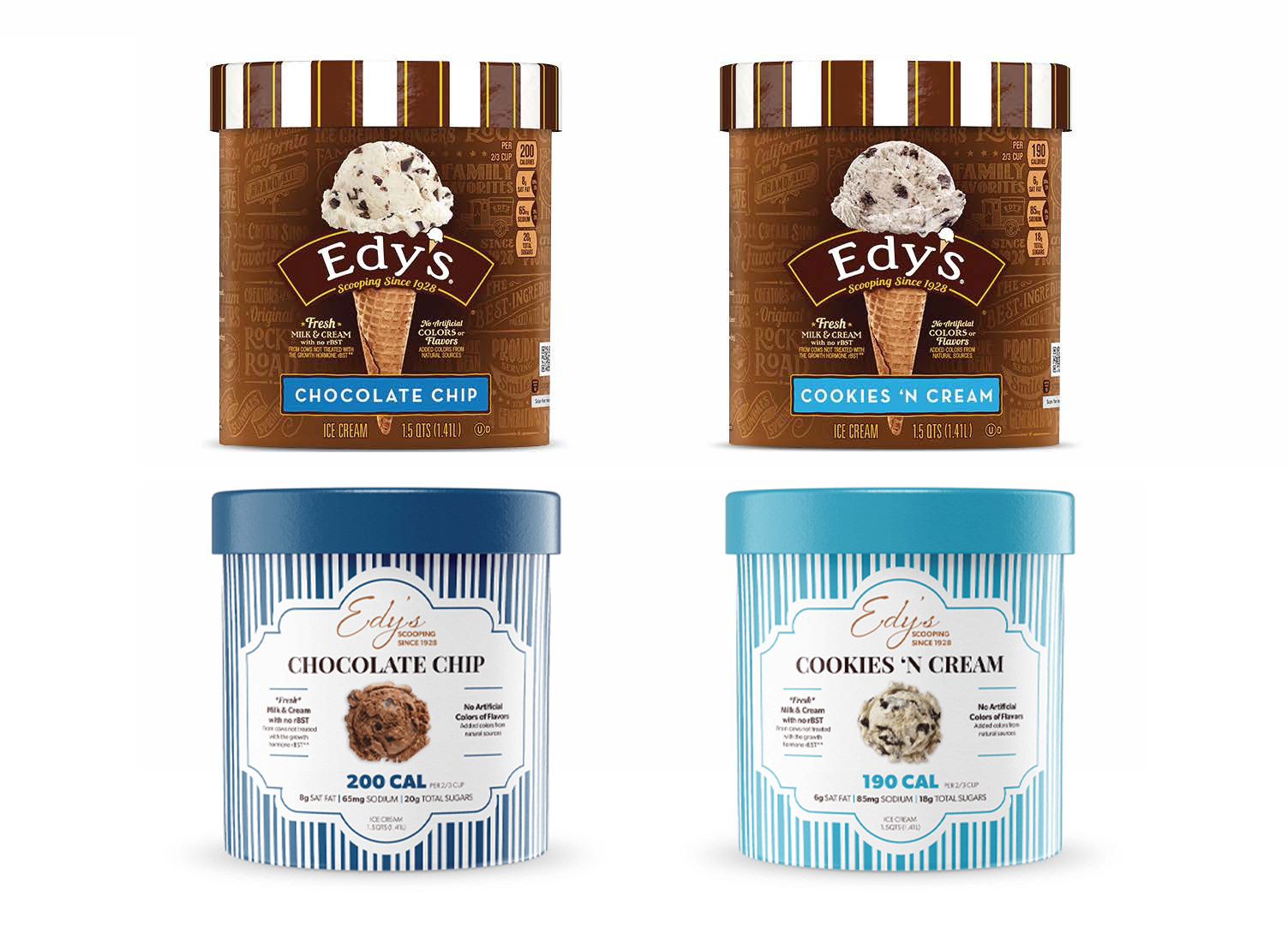
To continue exploring the world of package design, I decided to redesign the packaging for the ice cream brand Edy’s. My goal was to give the brand a fresh, modern look while still holding onto the nostalgia that makes it so recognizable. The redesign included developing a new logo and brand identity, along with a signature packaging style that could stand out individually while feeling cohesive across an entire product line.
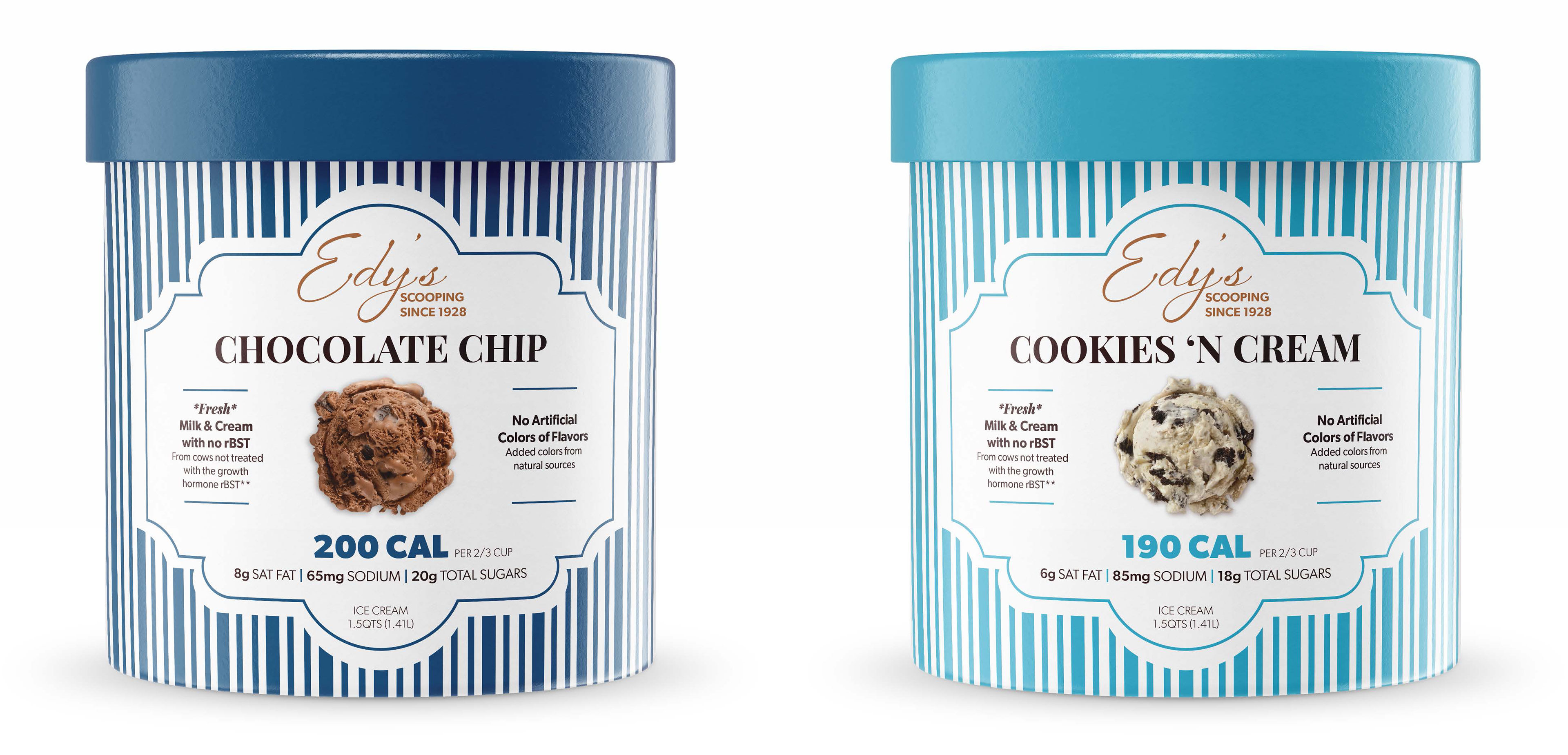
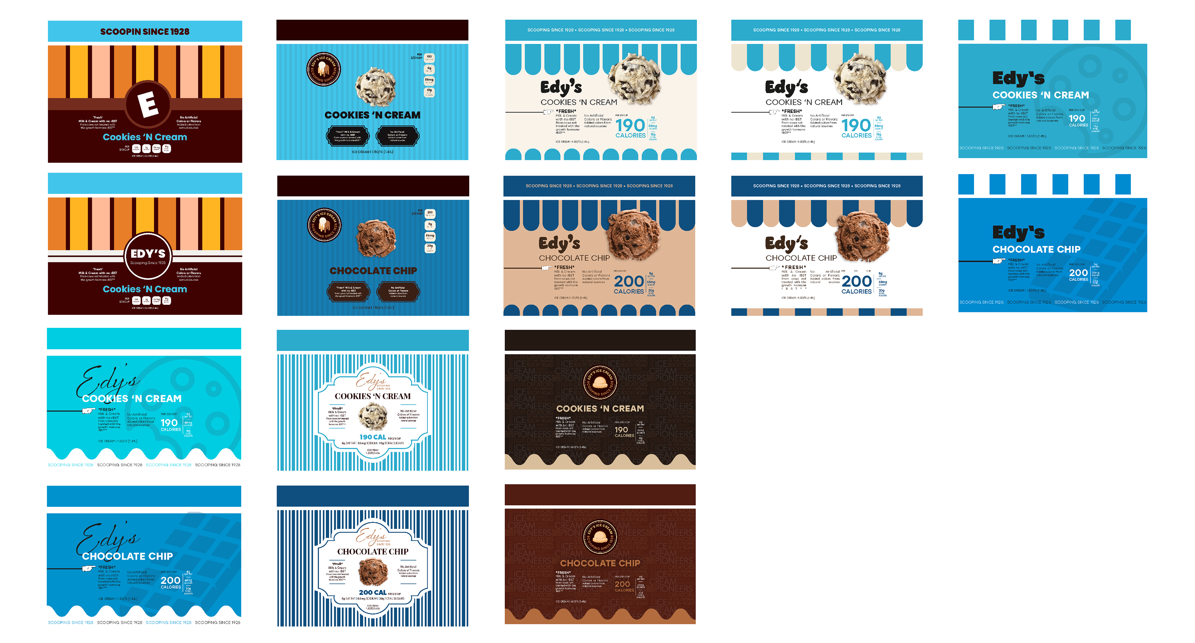
During my research and idea exploration, I noticed a simple but consistent design element used by many ice cream brands—colorful stripes. Whether classic or contemporary, stripes seemed to be a go-to, so I chose to incorporate them as a key visual feature. While this redesign focused on just two flavors, the broader vision was to ensure that each pint could stand on its own while still feeling like part of a unified collection.
The final design gives a subtle nod to Edy’s roots while presenting the brand in a fresh, playful, and modern light.